Linear Team
Enhancing the Sign-Up Process for Linear Team
Desktop
SAAS
Maintenance & Operation
PROJECT OVERVIEW
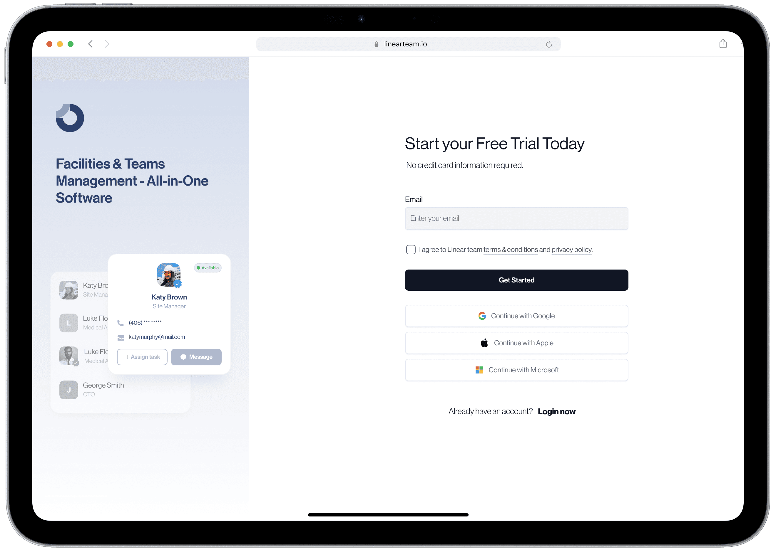
Linear Team is a SaaS-based tool designed for facilities and teams management, catering to businesses seeking efficient management solutions.
In this case study, I'll detail how I improved Linear Team's sign-up process to increase conversions by 42%.
MY ROLE
User Research
Visual Design
TOOLS
Figma, Figjam
Whimsical
DURATION
4 Weeks
PROBLEM STATEMENT
The high bounce rate and abandonment during sign-up were directly impacting Linear Team’s ability to convert visitors into paying subscribers. Addressing this issue was crucial for the platform’s growth and overall success.
MY OBJECTIVE
The primary goal was to identify why a significant number of users were abandoning the sign-up process, leading to low conversion rates and poor subscription growth. We aimed to uncover the pain points users experienced during registration and develop a more intuitive and engaging flow.
To start this phase, i started off with the quantitative research approach to gather insights into user challenges by using the following method:
12
User Surveys
I conducted 12 user surveys targeting those who abandoned the sign-up process to gain insights into their frustrations and reasons for not completing the registration.
51
Follow-Up Emails & Feedback
Follow-up emails were sent to users who did not complete the sign-up, asking for feedback on their experience and suggestions for improvement.
98
Google Analytics
I utilized Google Analytics to analyze user behavior during the sign-up process. This helped pinpoint where most users were dropping off and provided quantitative data to support our findings.
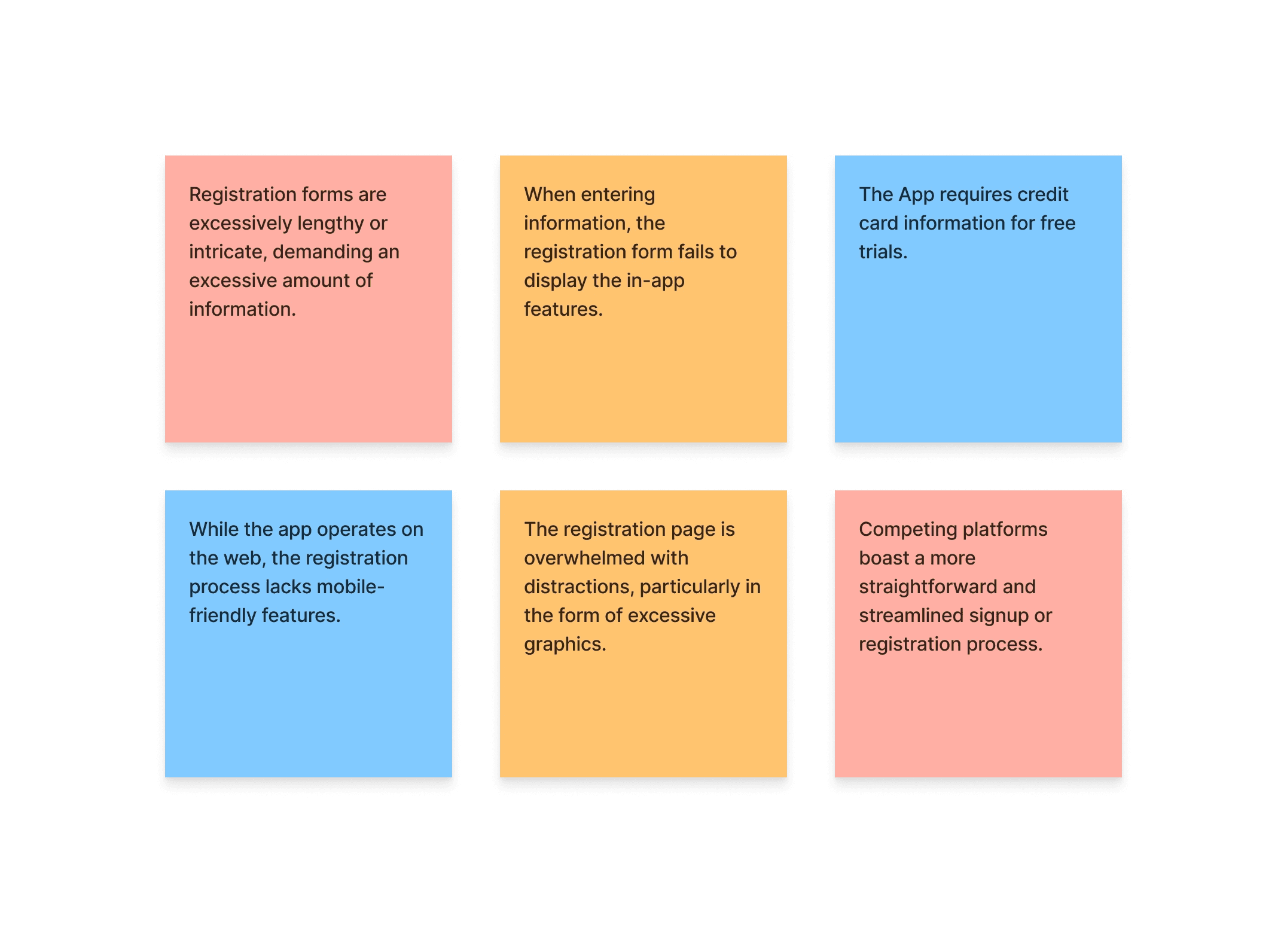
Based on the research findings, several critical issues contributing to the high bounce rate were identified.
This is what we learnt:
1
Lengthy Forms
The sign-up process required users to fill out long, cumbersome forms, leading to frustration and abandonment.
2
Lack of Information on App Features
Users were not adequately informed about the app’s features during the sign-up process, resulting in uncertainty and a lack of motivation to complete the registration.
3
Excessive Graphics
The overuse of graphics created a visually overwhelming experience, distracting users from the primary task of signing up.
4
Credit Card Requirement for Free Trials
Requiring a credit card for a free trial created a barrier, as many users were hesitant to provide payment information upfront.
Highlighting the user issues (Stickies)
While many visitors access the Linearteam registration page, only half of them actually complete the registration process.
Our Approach to address the identified problems, I collaborated with the team to brainstorm potential solutions that would streamline the sign-up process and enhance user engagement
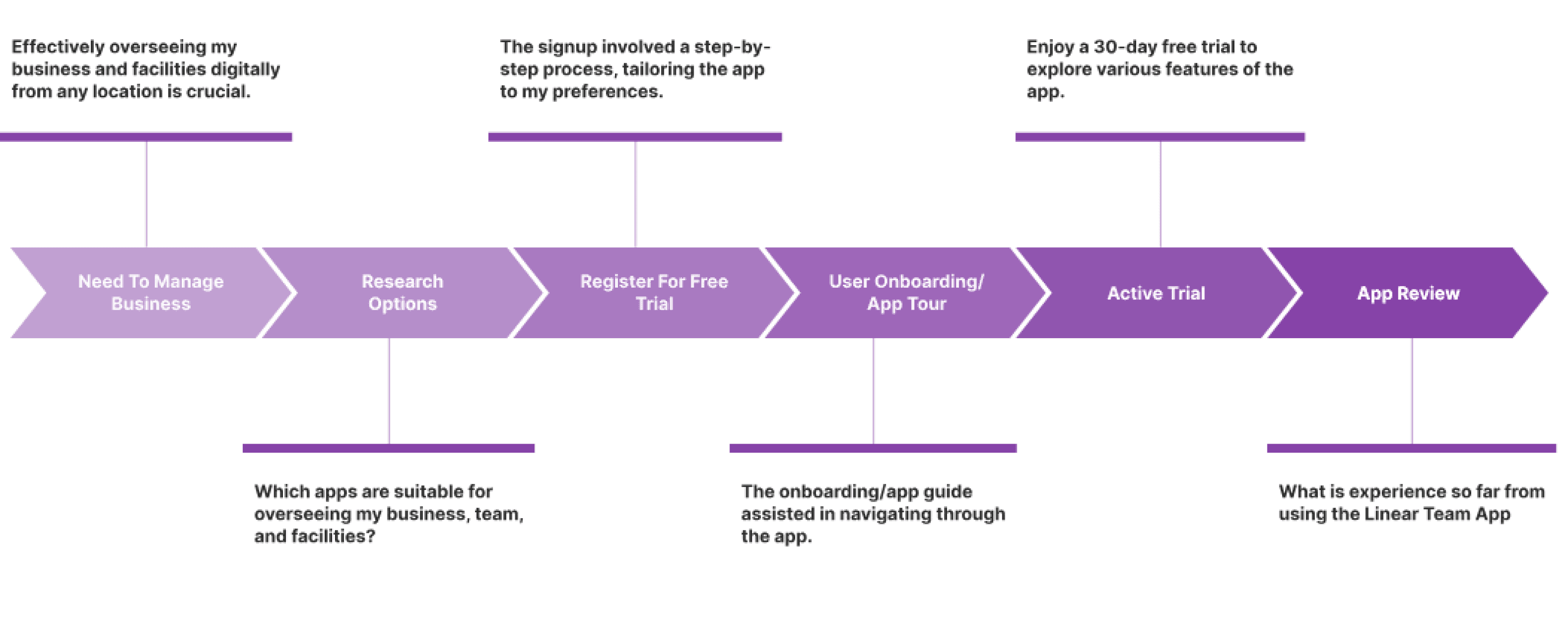
User Journey Mapping
I created user journey maps to understand the current user flow and identify opportunities to improve the experience. The goal was to simplify the process and provide clear guidance at each step.
Key Changes Implemented
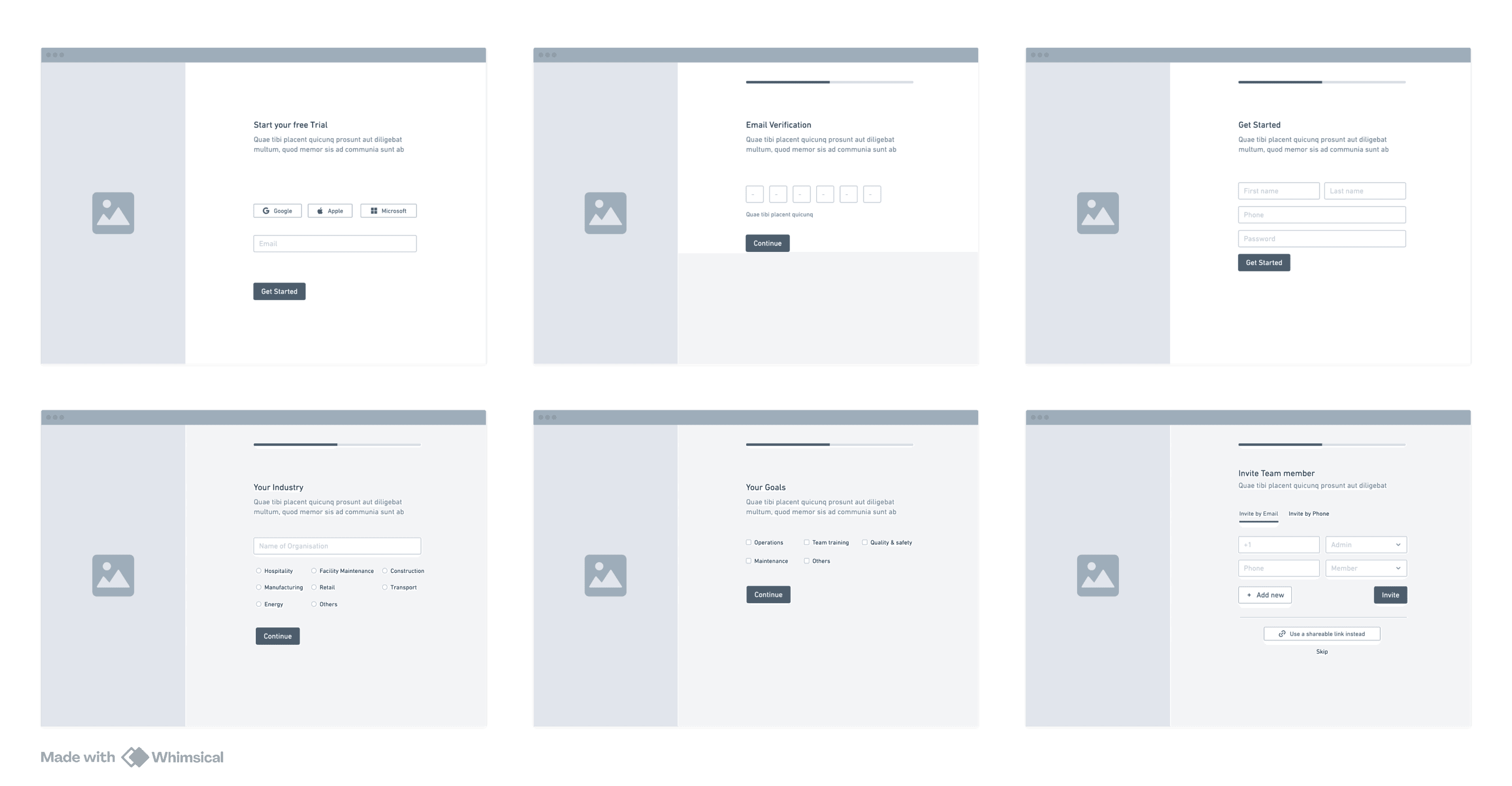
Moving from a Static Single-Page Form to a Stepper Form:
We transitioned from a lengthy, static single-page form to a stepper form that guided users through the process step-by-step. Each step provided quick tips about the software and explained the purpose of the requested inputs, helping users understand how the information would be used to customize the tool based on their goals.
Continue with Google
Continue with Apple
Continue with Microsoft
Implementing Modern Sign-Up Options:
To reduce friction, we moved away from requiring only an email or phone number for sign-up. Instead, we introduced options for users to sign up with their Google, Apple, or Microsoft accounts. This web3 approach made the process faster and more convenient, reducing drop-off rates.
Low-Fidelity Wireframes
I developed low-fidelity wireframes to sketch out a simplified and more intuitive sign-up process. The focus was on reducing the number of required fields, grouping related information, and providing clear instructions and progress indicators.
Final Solutions
Using tools like Figma, I created interactive prototypes to simulate the new sign-up flow. These prototypes were shared with the team for initial feedback and further refinement.
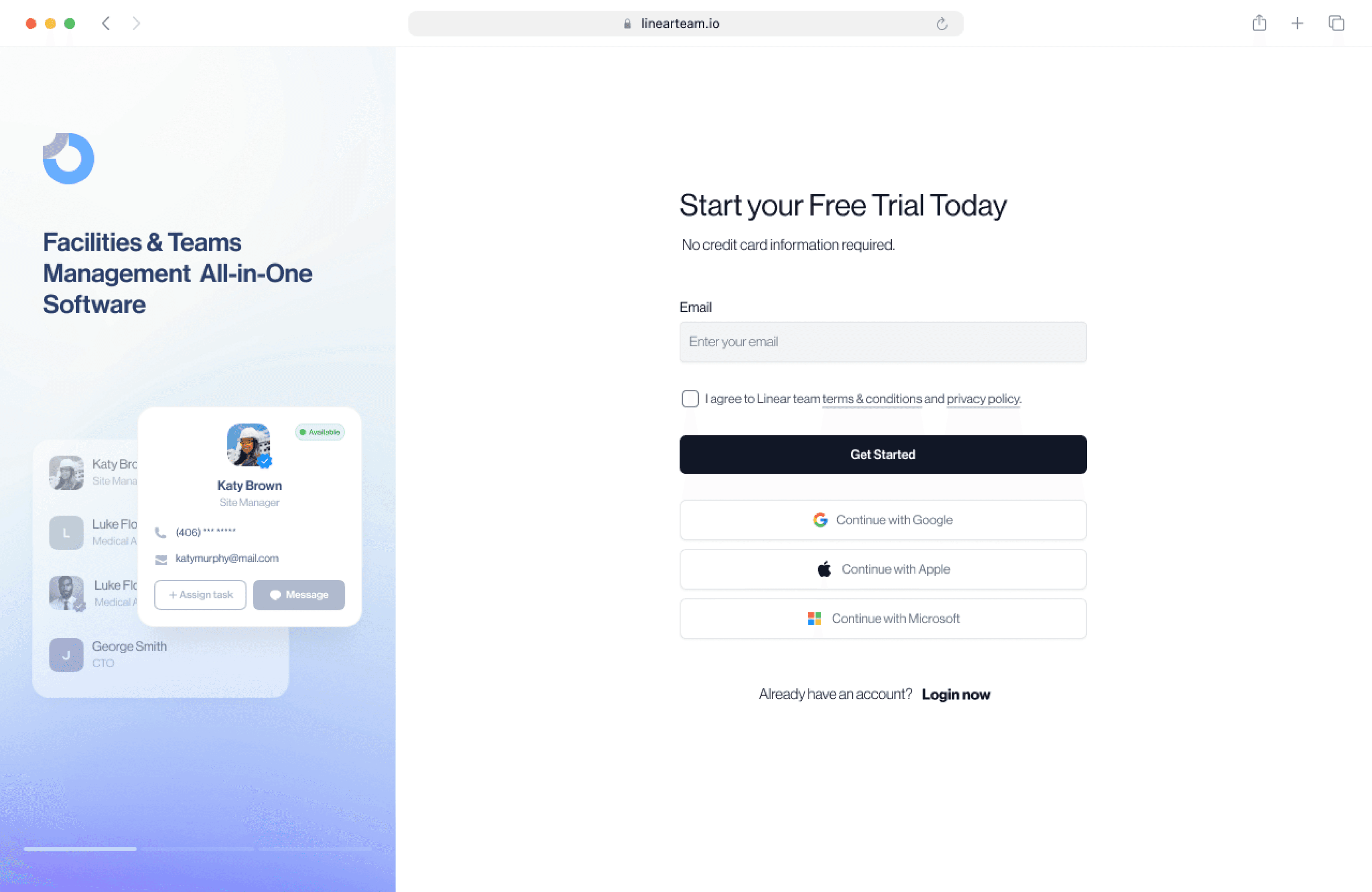
Simplified & Modern Sign-Up Options
Simple sign up highlights the app's features and lets you sign up quickly with Google, Apple, or Microsoft.
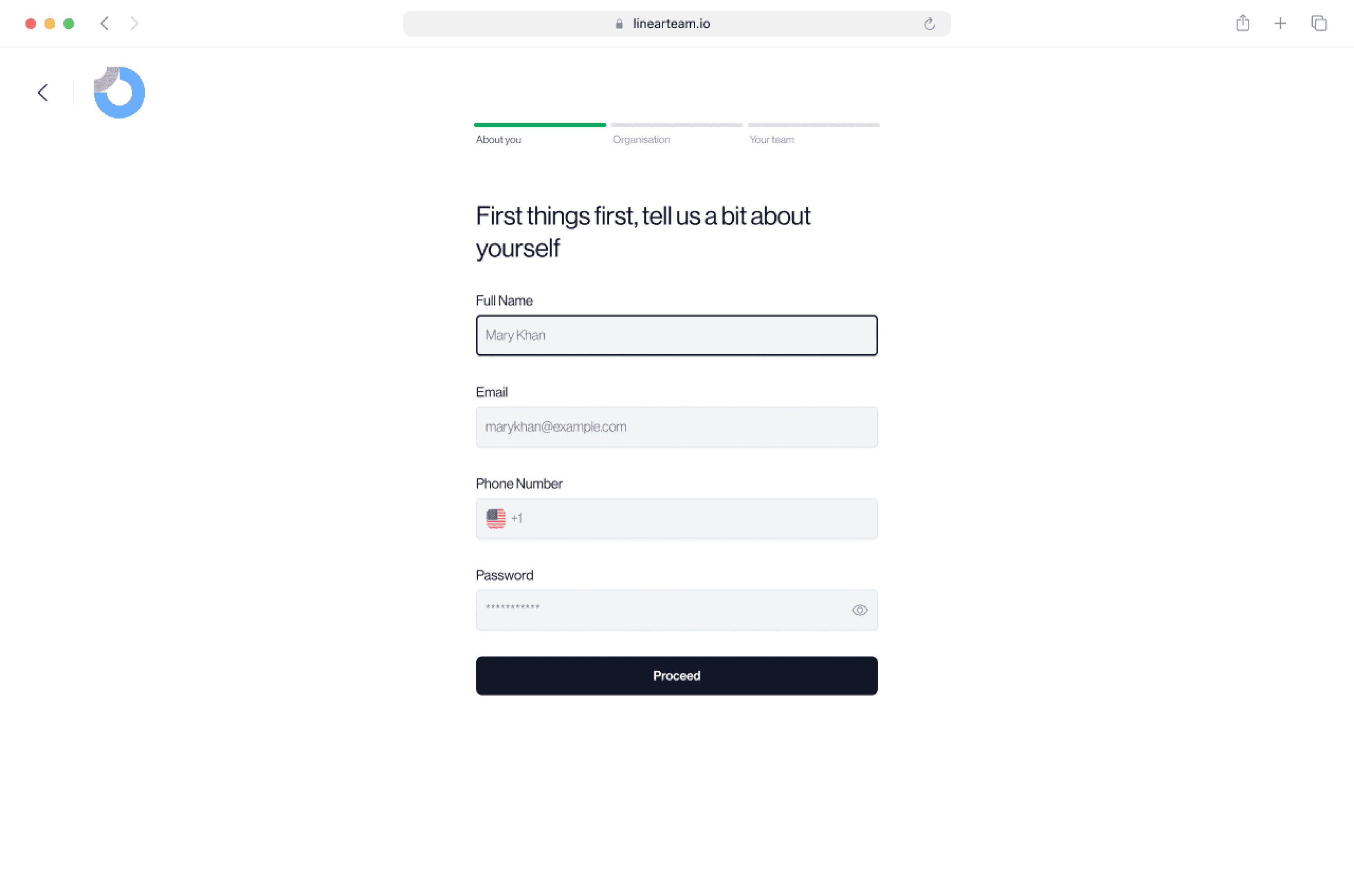
Step-by-Step Registration Form
The signup process is now in steps, making it easier to fill out. Each step explains why you need the information
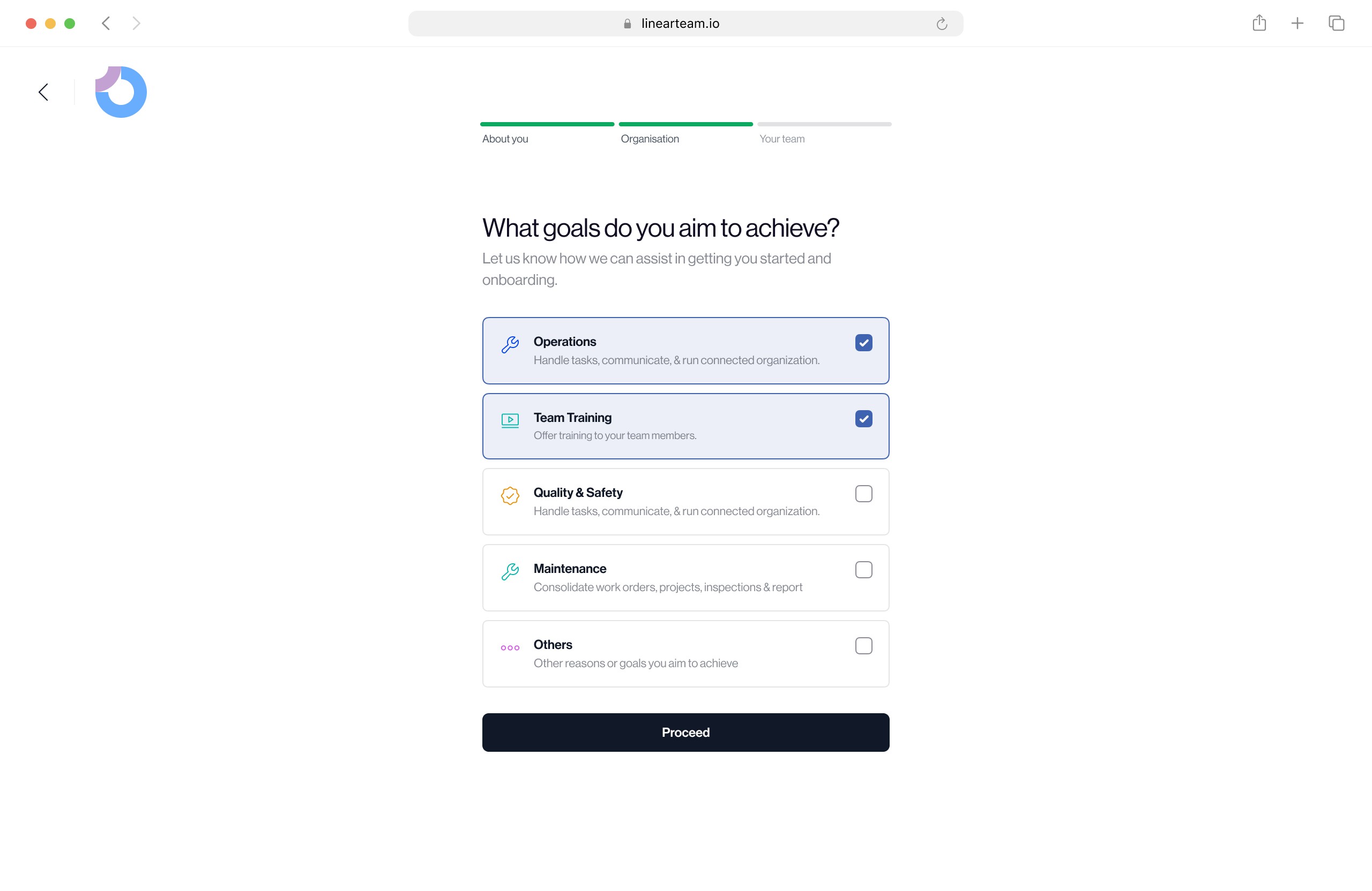
Set Goals to Create a Personalized App Experience
Set goals to get a personalized app experience. The app will suggest features and tips based on your goals to help you succeed.
Invite Team members
Set goals to get a personalized app experience. The app will suggest features and tips based on your goals to help you succeed.

Due to the team’s agile nature, the designs were handed off to project managers for review and testing immediately after the high-fi prototypes were ready to quickly identify any issues and make necessary adjustments.
Testing and Results
The new sign-up process was tested with a group of users, resulting in a 61.2% success rate in user registration—an improvement from the previous rates.
Getting Feedback and Iterating Minor Changes
Visibility Issues
During testing, it was observed that some font colors were not very visible against the background, which could hinder readability. This feedback was taken into consideration, and the font colors were updated to improve contrast and visibility
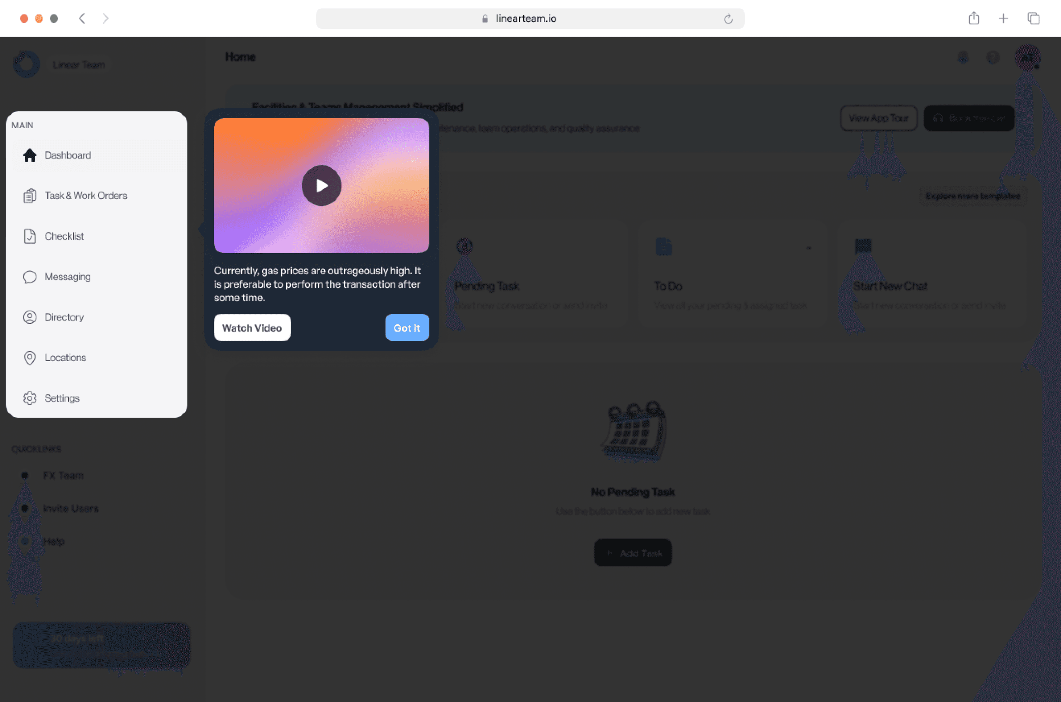
Tooltips Addition
Another update included designing tooltips on the dashboard post-registration. These tooltips served as a tour guide for new users, helping them navigate the app and understand how to utilize its features effectively.
User Feedback is Invaluable:
Engaging with users through surveys, feedback, and testing provided crucial insights that guided the design process and helped in making data-driven decisions.
Simplified Processes Lead to Higher Conversions
Streamlining the sign-up process by breaking it into steps and reducing unnecessary fields and requirements significantly increased the registration success rate.
Visual Clarity Enhances Usability
Ensuring that visual elements are clear, concise, and aligned with user expectations is key to a successful user experience.
By revamping the sign-up process and focusing on user-centric design principles, we successfully reduced the bounce rate and increased user conversions, driving growth for Linear Team and enhancing overall user satisfaction.