Enter Password
Hint: Check submitted CV for password
Introduction
An AI platform like ChatGPT, users query data from their content and external sources such as Crunchbase. Users leverage the chat interface to interact with the AI, ask questions, and derive insights, often requiring the AI to access their own documents or specialized external tools. This project focused on a key area of the Model AI experience: the core chat page called Threads.
My UX initiative focused on redesigning the high-use chat interface to solve a specific, high-impact problem within the live product.
Overview
Role: UX Designer
Scope: UX Strategy • Interaction & UI Design
Company: [NDA – AI Startup]
Timeline: 1-week sprint
Design Process
To ensure consistent, high-quality outcomes and adaptability across diverse projects, my design work is guided by a methodical process, tailored to the specific stage and requirements of each initiative.
Understand and Define
Brainstorm & Ideate
Sketch & Wireframe
Testing Solution
HOW IT STARTED
UNDERSTANDING THE PROBLEM
Following a stakeholder call, I was provided with a comprehensive brief and a Notion document that synthesized existing research. This document clearly identified several core user pain points and underlying problems, which included:
Conflicting Attachments: Users faced confusion and duplicate UI due to two separate attachment methods, one via the dashboard sidebar and one from the input field (local device only). Tools and attachments were separated in the UI, despite serving complementary roles during search.
Underused Tool Integrations: Tools like web search and Crunchbase were underutilized because they weren’t visible or intuitive during a user’s flow.
Cluttered Sidebar: The sidebar was dense and distracting, taking up significant real estate without providing clear value at all times.
Business Objective
Streamline uploads to boost engagement by making file sharing frictionless and intuitive.
Surface tools contextually so users discover features naturally when they’re most relevant.
Declutter the UI to improve focus and usability without compromising functionality.
WHAT I DID NEXT
DEFINING THE PROBLEM
To kick off the project, I prioritized gaining a comprehensive understanding of the existing problem. I utilized FigJam as a collaborative tool to articulate and organize the identified issues on digital stickies, ensuring a clear and shared view of the challenges.
A critical part of this initial phase was experiencing the current user flow directly. This hands-on walkthrough allowed me to develop genuine empathy for the challenges users encountered, providing invaluable insights that guided the subsequent design process.

TIME TO GET CREATIVE
BRAINSTORM & SKETCH
After understanding the problems, I used my UX skills to break down the current chat experience. I mapped out everything interactive: file attachments, tool buttons, how you type, and what's in the sidebar. This helped me find the main issues.
To get ideas for solutions, I then turned these issues into "How Might We" (HMW) method:
How might we make attaching files easier without losing options?
How might we get users to use tools more without overwhelming them?
How might we clean up the sidebar but keep it useful?
After using the "How Might We" (HMW) method to brainstorm ideas. A key part of this brainstorming involved competitive analysis. Due to project timelines, leveraging existing solutions from similar problems helped us quickly develop strong ideas. During this phase, concepts like a centralized attachment system and a collapsible sidebar began to take shape.
I then designed a few initial concepts.
CONCEPT 1 (INPUT FIELD REDEFINED)
tooltip pointing to tools
external tools
e.g crunchbase
floating fab
Attach button
Attachment
Text field
Send message
CONCEPT 2 (INPUT FIELD REDEFINED)
Attach button
Send message
Text area
External tools
e.g crunchbase
tooltip pointing to tools
Floating fab
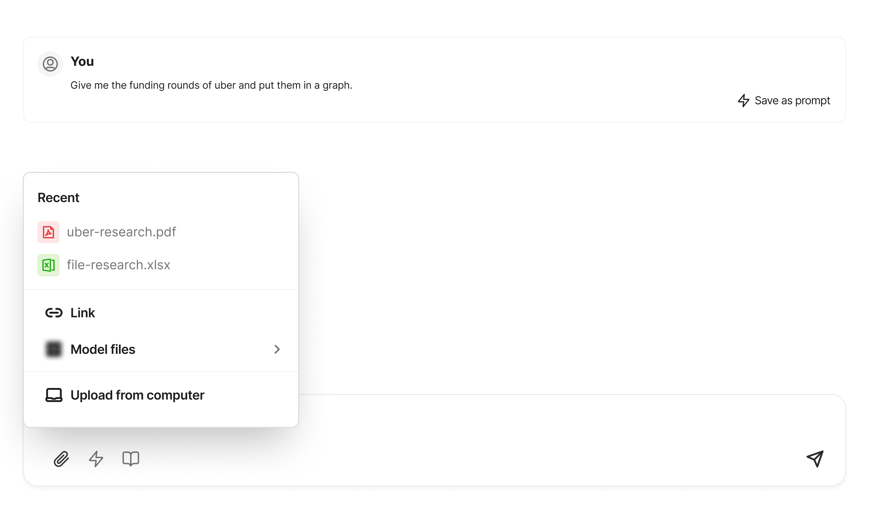
SIMPLIFIED & ALL IN ONE ATTACHMENT
Upload with link
Recent files
Upload with internal file
Upload from computer
How Competitive & Comparative Analysis Helped
To ensure our solutions were intuitive and familiar, I conducted a competitive and comparative analysis. I reviewed analogous interfaces.
These insights were vital in anchoring our solutions in interaction patterns users were already accustomed to, making the new features feel natural and easy to adopt.

Grammarly: For how it surfaces contextual tools

Slack and Notion: To understand their attachment workflows.

Google Docs: Showcased effective use of floating tools.
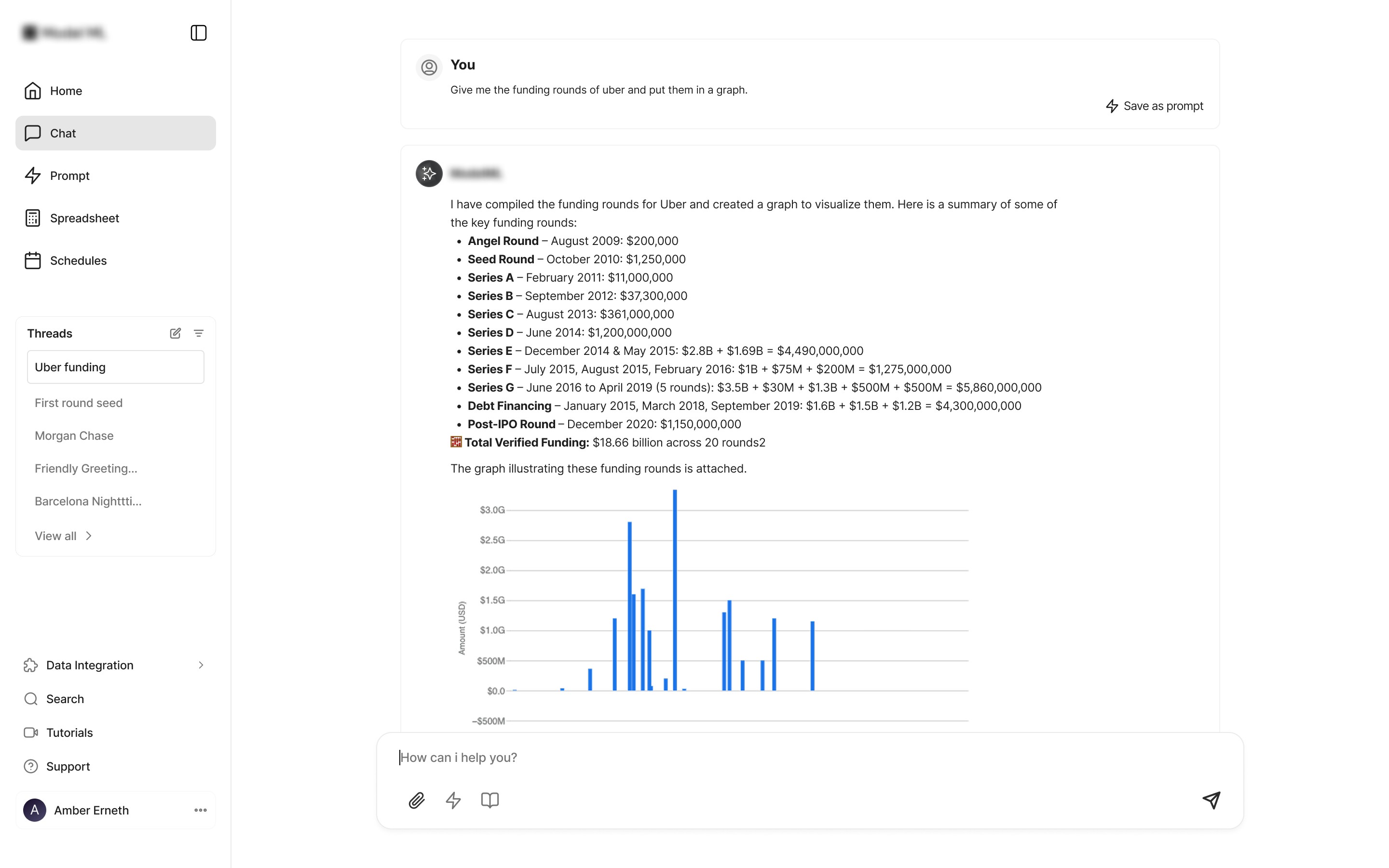
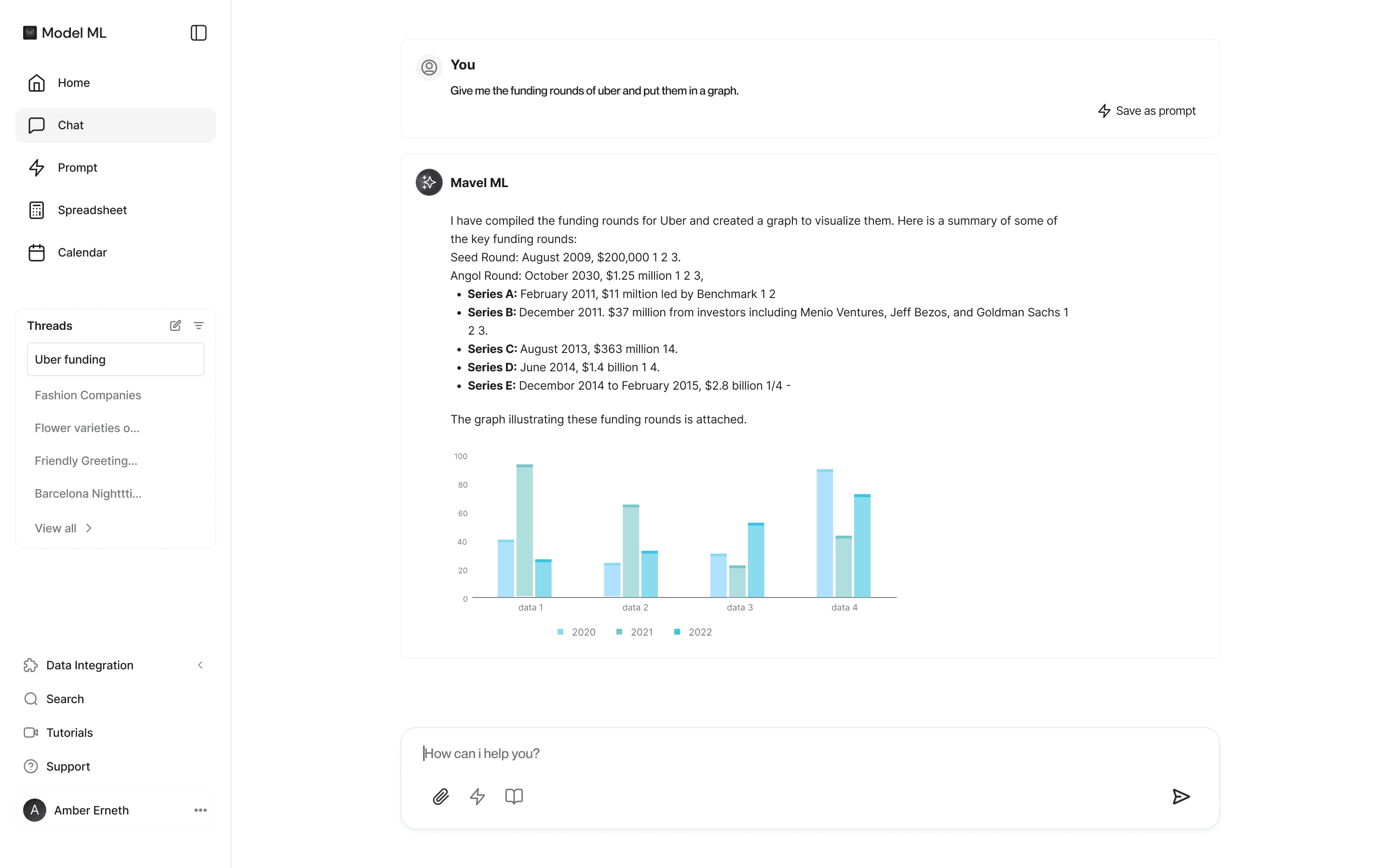
User Flow Redesigned
With all these, i had come up with a new user flow which shows how a user can attach files in a simplistic and straight forward way. User uploads a financial document mid-chat and uses an integrated research tool to search Crunchbase all in one view. without

LOW-FIDELITY WIREFRAMES STILL DELIVERS
WIREFRAME
I designed low-fidelity wireframes using wireframe.io to visualize the new concepts I'd sketched. This helped us get an early look at how these ideas would function. We tested these internally to check their feasibility. After a positive review, we got the green light to move to high-fidelity design.
Some concepts we tested included sidebar collapsibility and how it would impact the main content area.
🎨 DESIGN SHOWCASE
Dashboard UI
Preview of the Before and after of the dashboard design
Before
After
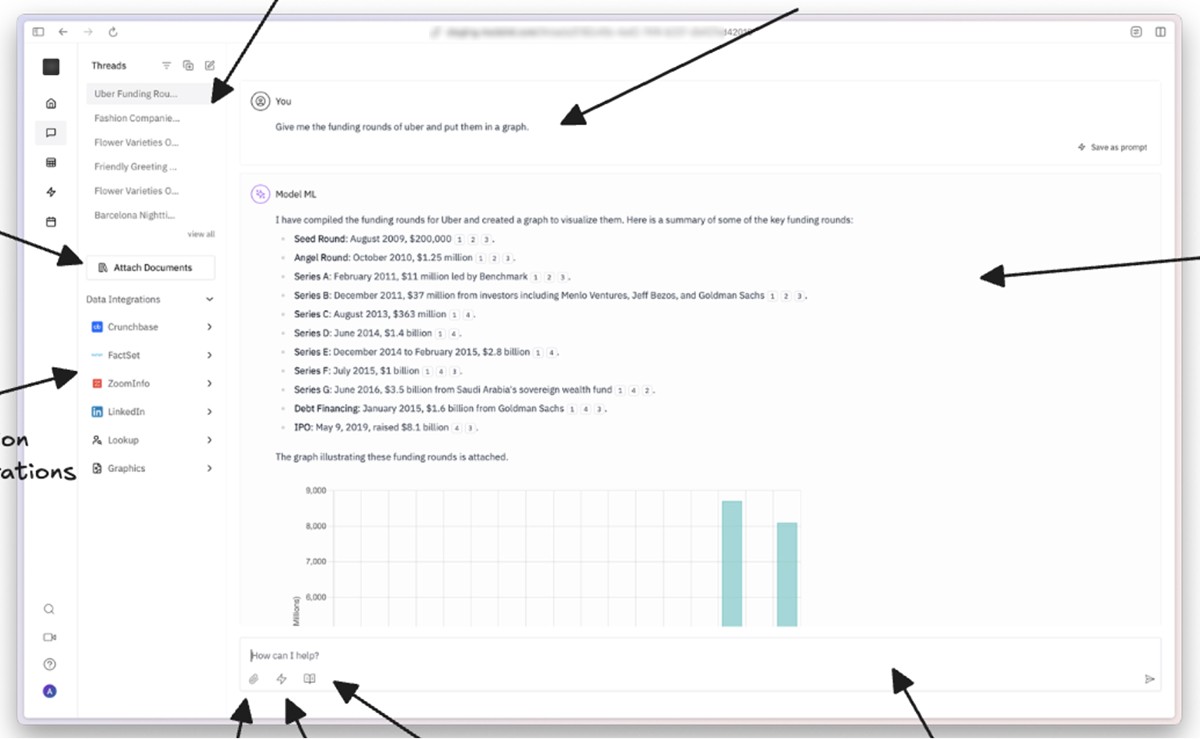
Unified File/Document Attachment
This Shows how users had to upload files from different location to now a centralized
Before
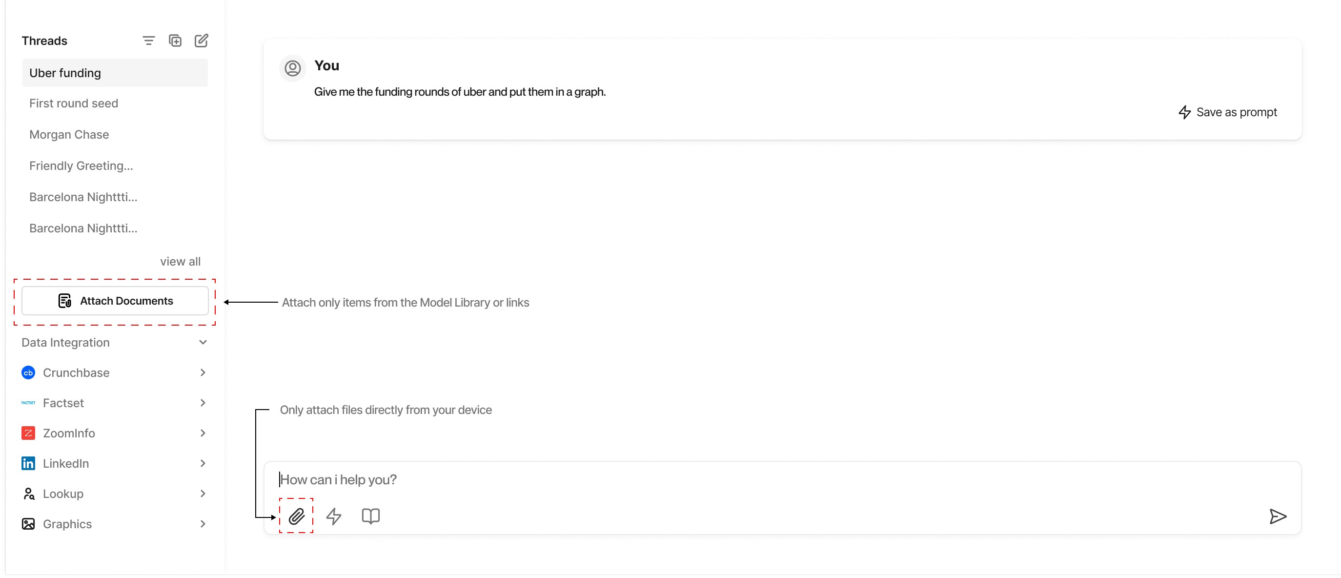
After
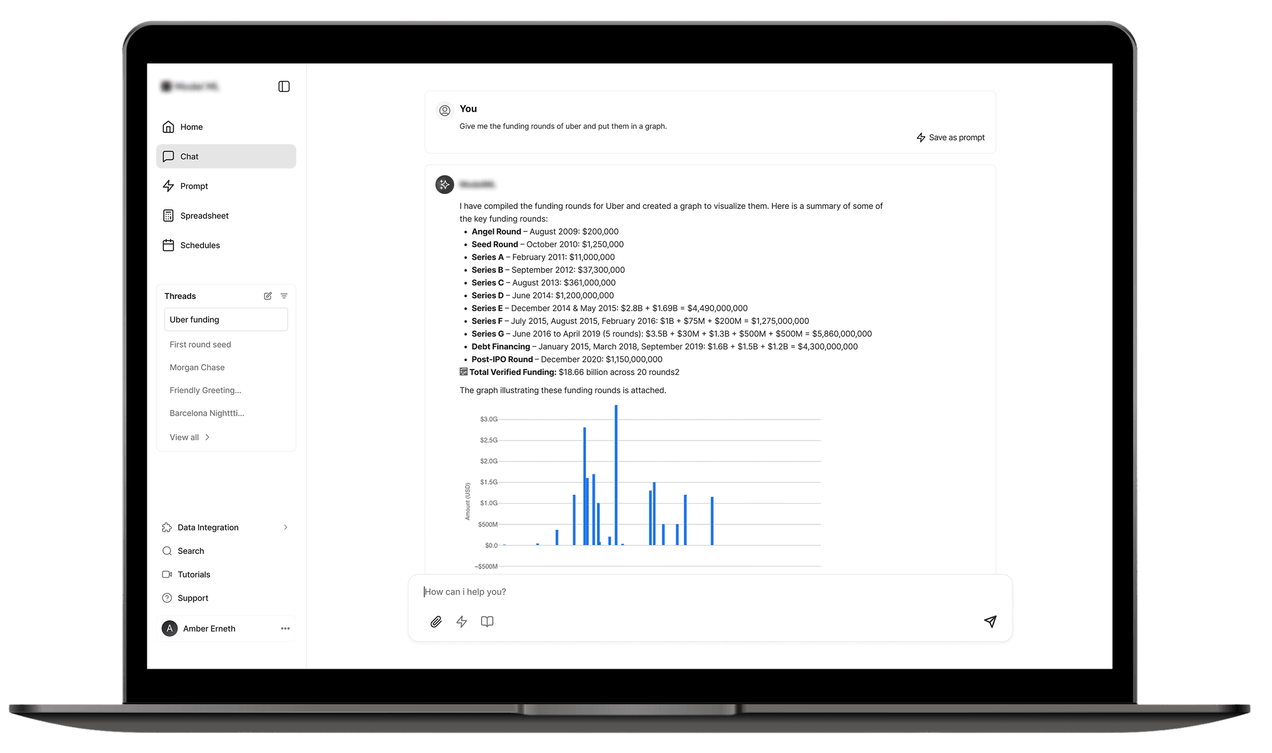
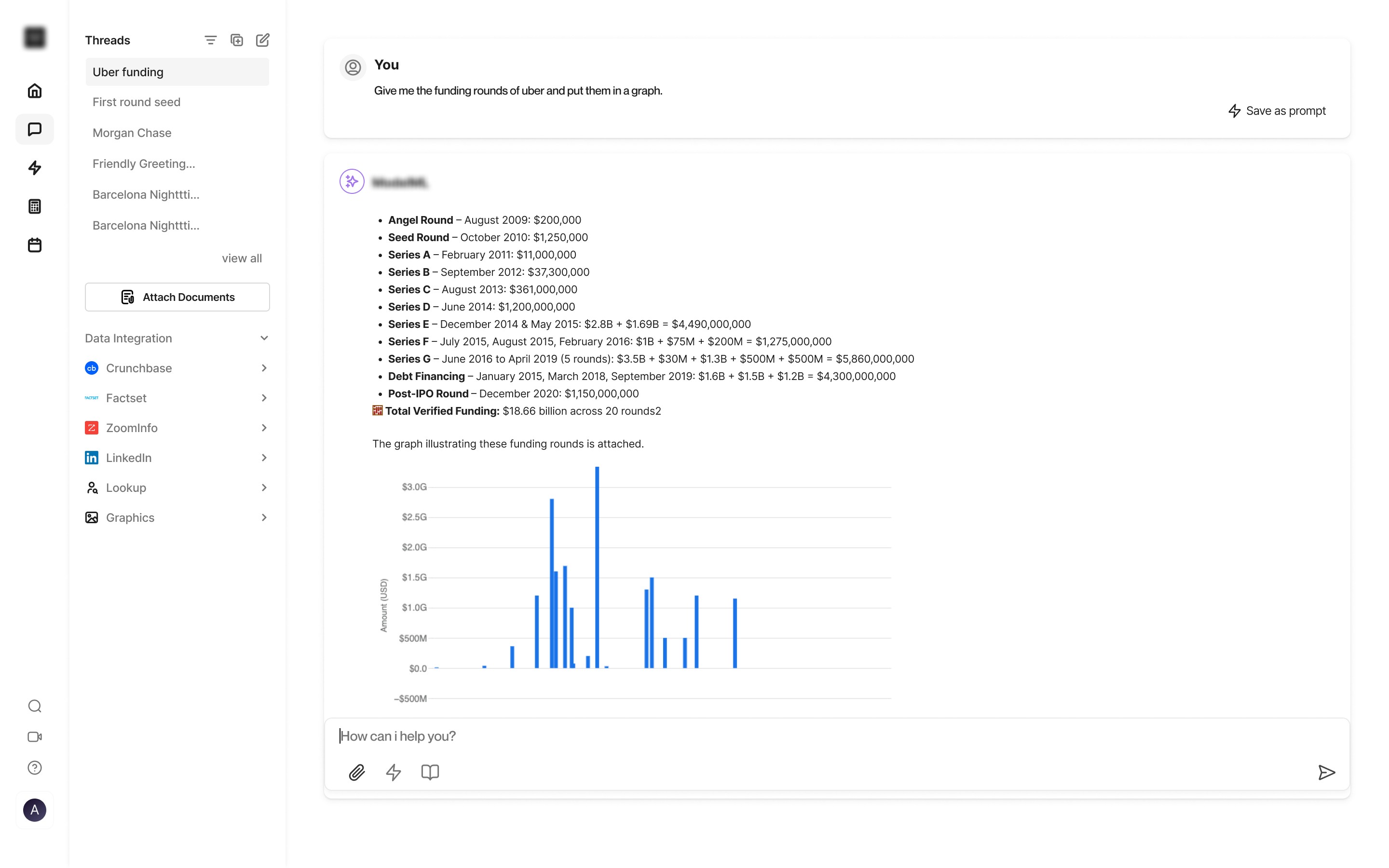
Better Tool Discoverability
Enhancing discoverability with a floating toggle—featuring bubble animation and tooltips. This prototype shows the interaction state mid chat from default state to active state: when a user starts typing, a 3 seconds bubble with tooltip reminding users they can add more tools to enhance their search.
The option to add more tools for searching had been moved from the sidebar which was distant into the chat box where it was useful.
Sidebar Simplified
Sidebar is collapsed by default, but open fully when expanded. This helps users choose what mode they prefer and allow for full view when these tools are needed. This way only required tools are handy. A hover state also displays the sidebar but is fixed and collapses on mouse leave. This allows users to choose how they use the sidebar, the collapse and expand icon at the top ensures allows the sidebar state to be set while the hover showing the sidebar expanded is temporary.
Hi-fidelity prototype illustrating the simplified sidebar behavior
COMPONENTS: EXPANDED VS COLLAPSED

PREVIEW
ITERATION AND FEEDBACK
TESTING THE SOLUTION
An iterative design process thrives on feedback. Following the initial design phase, I actively sought input from key stakeholders, including product managers, engineering leads, and other designers.
Feedback sessions involved presenting wireframes and high-fidelity mockups, explaining the rationale behind each design choice, and facilitating open discussion. Key areas of focus for feedback included:
A major feeback which was implementated was keeping the integration tools in the sidebar. My initial concepts was for the integration tools to only be visible in the chat area which i believed it was where it was useful. However, it was an eye opener to also understand that it was also useful in the case where a user wants to set the default integration tools without having to enable or disable everytime they wanted to use the chat feature.
Based on the insights gathered, I iterated on the designs, making necessary adjustments to refine interactions, clarify visual cues, and address any identified usability concerns. This continuous feedback loop ensured that the final design solutions were robust, user-centric, and aligned with the product's strategic goals. This iterative refinement was a cornerstone of delivering a high-quality user experience.
AFTER FINAL ITERATION
IMPACT
The implementation of these design solutions led to a tangible improvement in the AI chat experience. While exact quantitative metrics were restricted due to NDA, qualitative feedback and observed user behavior provided strong indications of success.
Reduced File Attachment Confusion
75%
Increased Tool Engagement
60%
Improved Interface Clarity
85%
My contributions directly translated into a more efficient, user-friendly, and powerful AI chat application, enabling users to more effectively leverage the AI's capabilities and integrated tools.
OUTCOMES AND REFLECTION
This project taught me how targeted UX interventions can drive major improvements within a complex, existing product.
The Power of Focused Improvements: a full redesign isn't always necessary. Targeting one core pain point significantly improved the user experience and increased feature adoption.
Making AI Features Discoverable: AI features are often powerful but hidden. I designed the contextual Floating Toggle Tool to surface functionality exactly when needed, making a complex feature feel simple and intuitive.
Proving Success Beyond the Numbers Lacking hard metrics, I built a compelling case for the design’s success by combining qualitative data from user observations, direct feedback, and stakeholder validation.
What I Learned:
This project proved that small, strategic UI enhancements can solve surprisingly deep usability problems. Thoughtful details, like timed microinteractions and decluttering, are powerful tools for guiding user behavior and increasing focus.
Next Case Study
Remedial Health