Mobile
AR Shopping
BACKGROUND
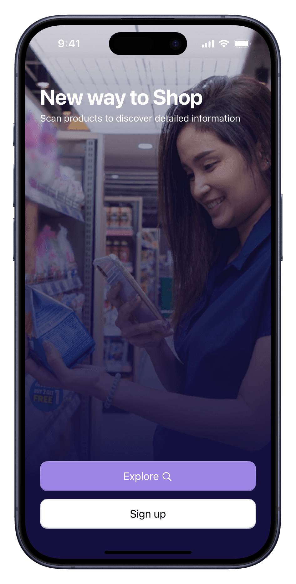
In our digital age, consumers are increasingly seeking experiences that are both convenient and informative. My goal was to design a mobile app that leverages augmented reality (AR) to revolutionize the way people shop in supermarkets, making the process more interactive, detailed, and community-driven.
This case study will walk you through my process of transforming the supermarket experience using Augmented Reality
MY ROLE
User Research
UI/UX Design
Branding
TOOLS
Figma, Figma
Moqup, Miro
DURATION
3 Months
PROBLEM STATEMENT
Shoppers struggle to make informed food choices due to limited product information in supermarkets. They crave more details about nutrition, origin, and sustainability while also seeking a more engaging shopping experience.
OBJECTIVE
Informative Shopping
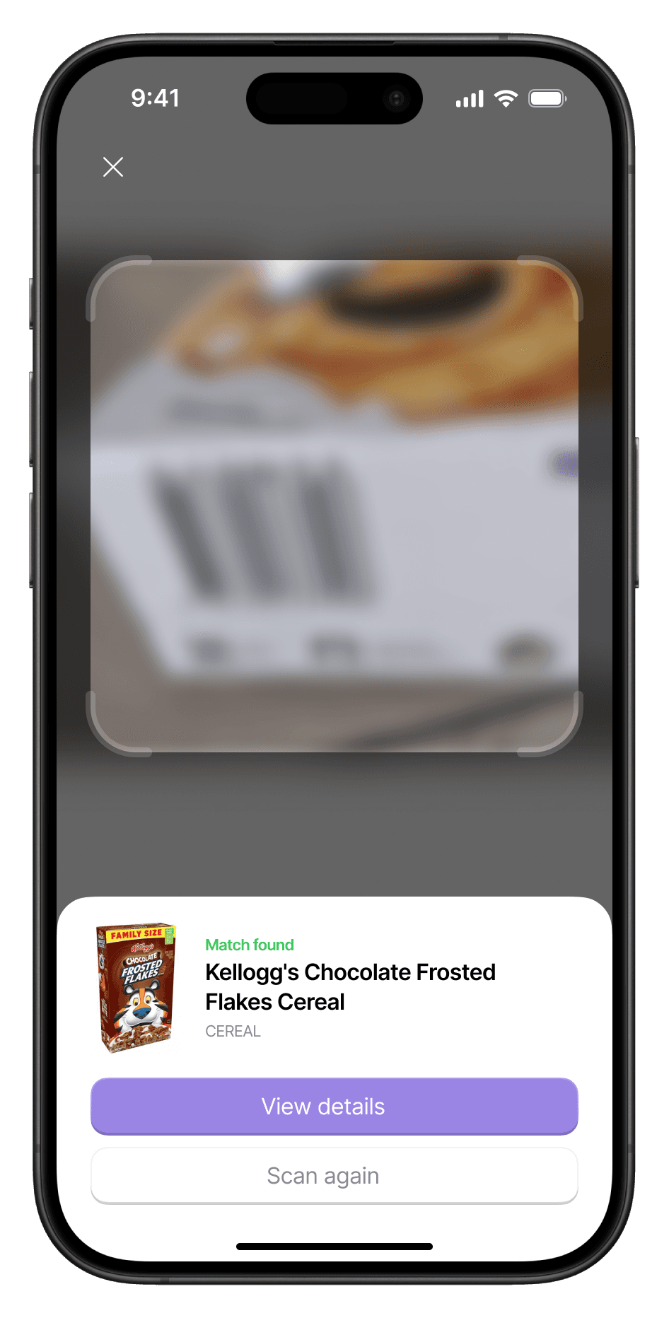
Provide detailed product information instantly using AR technology.
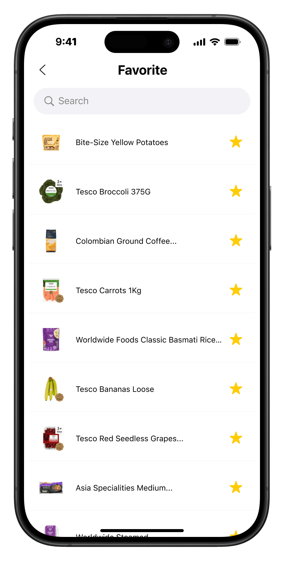
Smart Choices
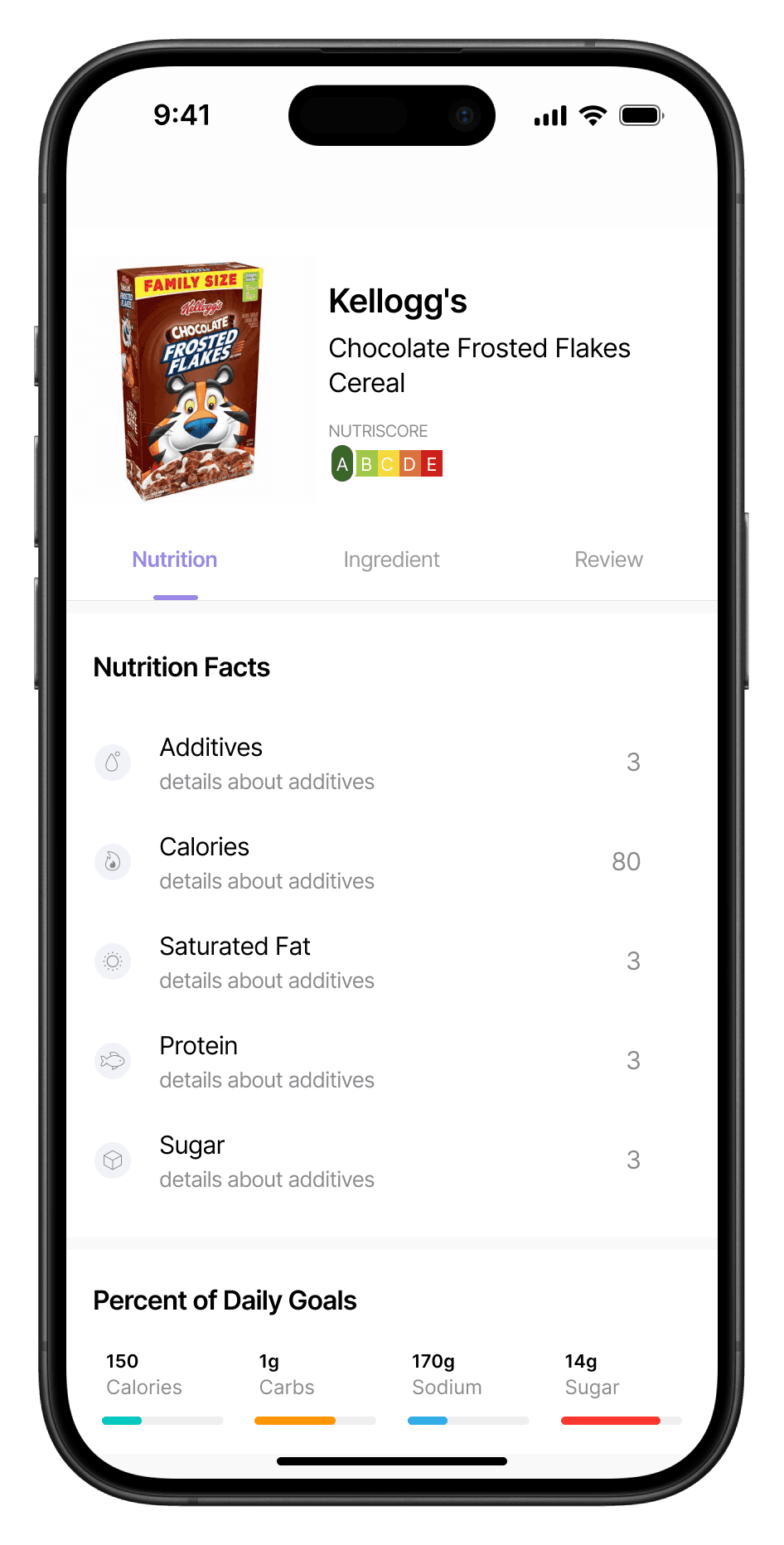
Empower customers to make better decisions with comprehensive product data.
Social Shopping
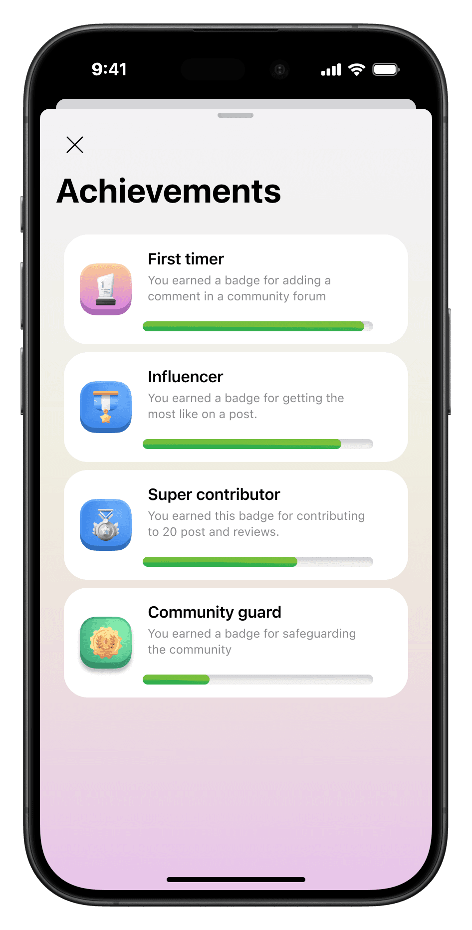
Create a community for sharing shopping experiences and recommendations.
Social Shopping
Improve overall shopping satisfaction through engaging and personalized features.
To pinpoint shopper needs, I analyzed past research data where findings revealed a growing gap between consumers' knowledge about food and the information available at supermarkets. In this stage, i conducted
5
User Interviews
15
Surveys
3
Market Analysis
User Interviews
During these interviews, one story stood out. Kate, a working mom, shared how she often found herself struggling to read tiny labels, unsure if a product met her family’s health standards. While this was a fictional interview generated from past quantitative interviews using the AI tool ChatGPT, it vividly highlighted a critical gap: the need for better product transparency.
Analysed the Market
Next, I examined existing AR tools in the retail space. While they offered visual experiences, they fell short in delivering the in-depth information users craved. This analysis confirmed that our solution had to go beyond aesthetics—it needed to provide meaningful insights.
Shopsavvy

Foodcheck

PureCheck
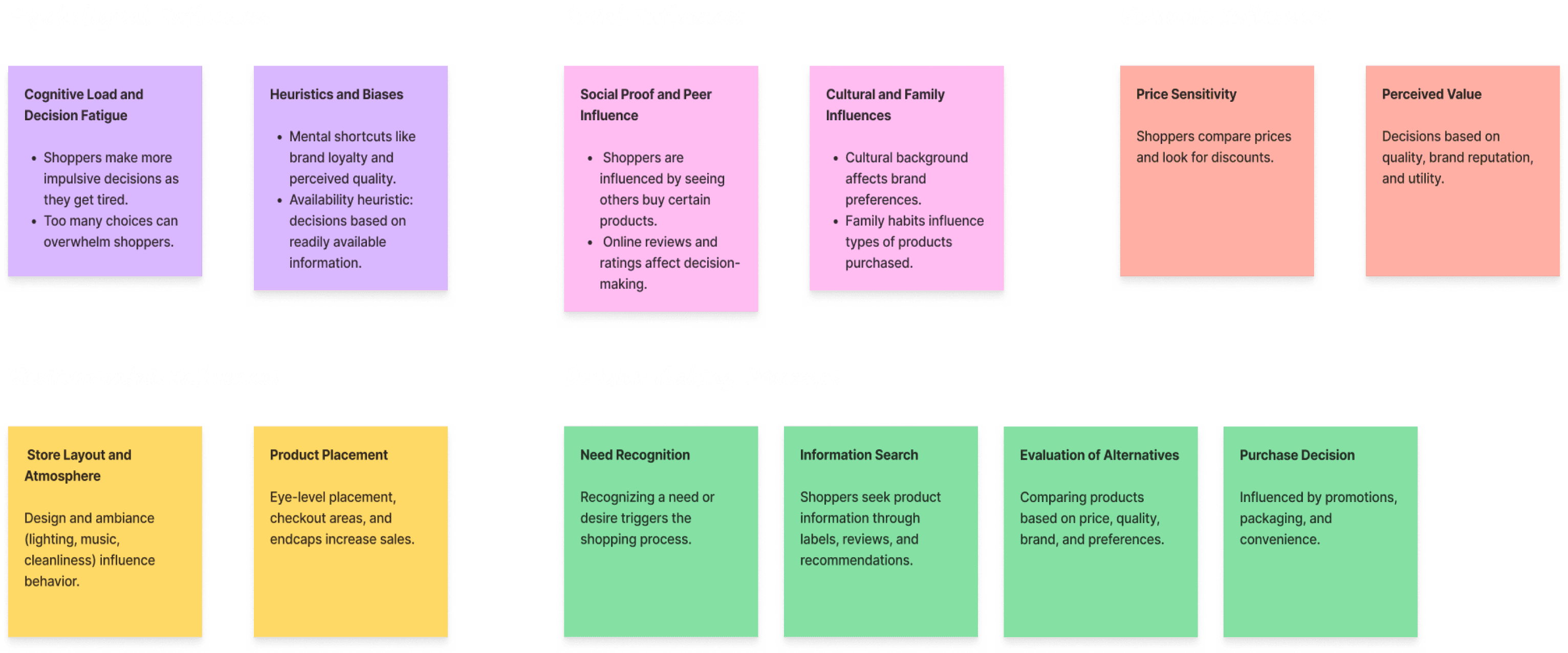
Key Insights from Research
The research findings were quite insightful. By sorting them into categories using sticky notes, I gained a deeper understanding of what influenced the users and the reasons behind their decisions.
Create User Persona
Developed user personas to guide the design, ensuring that the app meets the needs of various shopper profiles, from health-conscious consumers to tech-savvy individuals.

Emma Thompson
Female
Age
34
Occupation
Marketing Manager
Location
Seattle, WA
Tech Savviness
High
Goals
Easily access detailed product information, visualize products in your kitchen, and save time with quick reviews and recommendations.
Pain Points
Finds it difficult to access detailed product information in-store without spending a lot of time reading labels.
Frustrated by the lack of information on whether products are organic or GMO.
Often feels overwhelmed by too many product choices without clear guidance.
Motivation
Wants to make healthier, informed choices for her family and herself.
Enjoys using technology that enhances convenience and efficiency in her daily life.
Understanding our users' wants and pain points, I moved into Ideation phase. Using research insights, the goal was to create a digital yet simple shopping experience.
User Story
I created visual stories of how users would interact with the app. I imagined a health-conscious mother, Kate, using the app to learn about product ingredients and read reviews. We also considered a busy professional, Alex, who would quickly find and purchase healthy snacks.

Information Architecture
My next move was to create an information architecture to organize the pages and content, ensuring clear navigation and hierarchy.

It was time to bring the ideas to life and i started off my creating lowfi wireframes and prototyped them for user testing in order to validate and iterate our design.
User testing showed that —
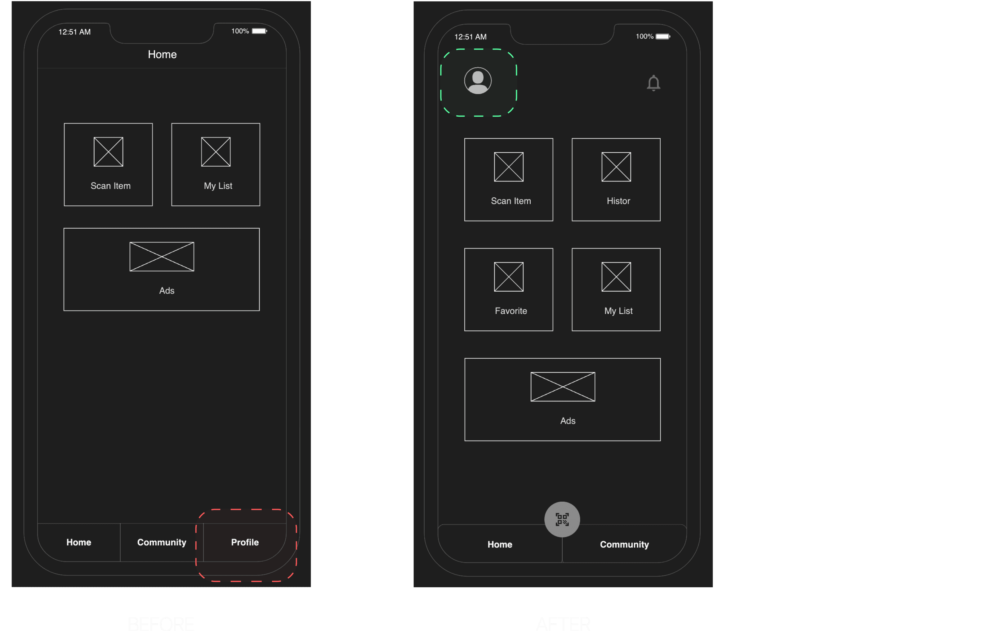
Users found the multi-tab pages cumbersome for quick scanning, often needing to return to the homepage to access the main feature. To solve this, I updated the design to a 2-tab system, making it easier to scan items. The scan icon was moved to the center for easy access, resulting in a 65% increase in user interaction.
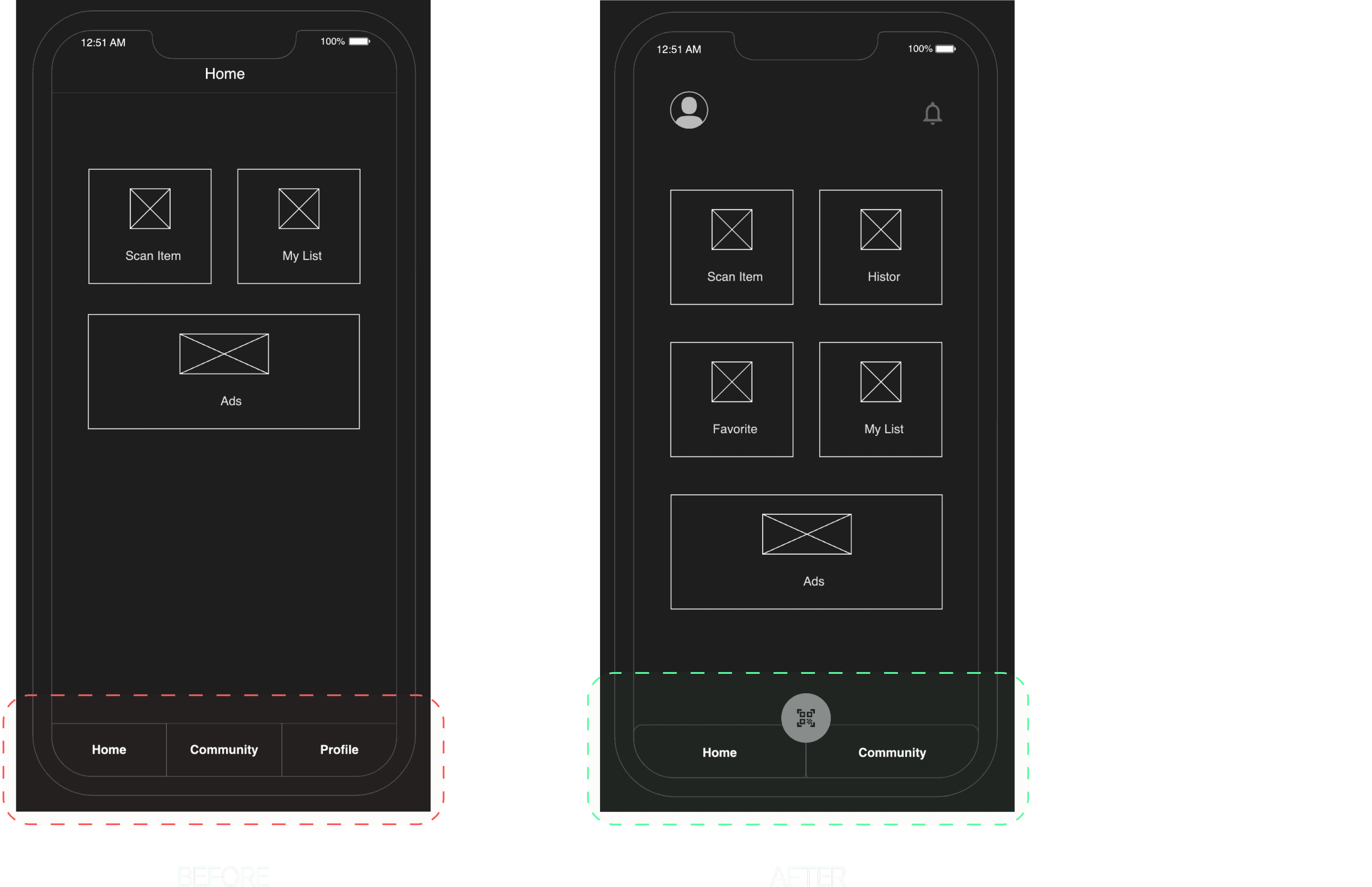
A key issue was that users struggled with the multi-tab pages, which made it difficult to quickly scan on the go. They had to return to the homepage to access the app's primary feature. To solve this I switched to a 2-tab system, making it easier to use the app’s primary feature—scanning an item. The scan icon was placed in the center and was accessible from any tab. This update led to a 40% improvement in user interaction.
Understanding our users' wants and pain points, we sparked new ideas in the Ideation phase. Armed with research insights, our goal was to create an amazing AR shopping experience.


The goal was to give shoppers all the info they need, let them connect with other shoppers, and make their shopping trips more fun.
What Went Right
I dove deep into understanding shopper behaviors to create a product that truly resonated. Through brainstorming and prototyping, I focused on building a solution that not only met user needs but exceeded expectations.
Challenges Faced
Balancing innovative ideas with practical limitations was challenging. Gathering constant feedback and fostering a sense of community within the app were also learning curves.
Lesson Learnt and Looking Ahead
I learned the importance of early testing and flexibility in the design process. Working closely with developers was essential to bring the vision to life.
I see huge potential for expanding the app with more AR features and reaching a wider audience. Personalizing the experience for each shopper is also a top priority.